In our previous post about automobile advertising, which covered the first decade of the 20th century and part of the second, three themes were dominant in the ads of that period, with each ad using one of three tested and proven approaches:
1. the straight-up facts – in other words, WYSIWYG
2. touting trouble-free efficiency – “give the people what they want,” a big challenge in this early period
3. personal testimonials – owners staking their reputations regarding their product
Advertising, of course, evolved as the cars got better. As it turned out, three themes also dominated the teen years, especially when advertising speedsters.
Here Barney Oldfield was racing against Glenn Curtiss at the Minneapolis State Fair in 1910. Probably staged! personal collection
Power
The nineteen-teens was an awesome decade for the wild and wooly, and if you wanted something powerful to drive, well then, you got yourself a speedster. This was a time when “men were men,” and women appreciated (or at least tolerated) that.
1915 Stutz Bearcat. Note the nationalistic cues.
Stripped down to its bare essentials, the typical cutdown of this period copied the competition versions that were tearing up turf tracks at county fairs, rumbling down public roads that had been cordoned off for a speed event, or clawing up hills to set elapsed time records. Or, they were the real deal disguised with lights, a muffler, and street fenders on them.
1911 Mercer Raceabout. Outfitted for the street, but also ready to race and win!
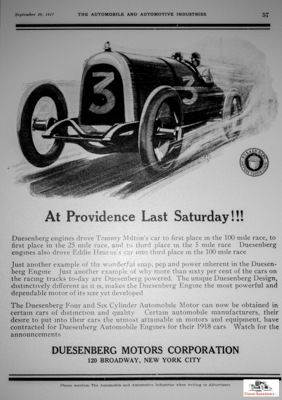
The ads for the successful pretty much said it all. The reputations carved by these beasts were diligently listed in print ads that sold the cars for that company.
1917 Duesenberg ad
1910 Marmon ad
Or the ads brought tire-kickers into the showroom, where folks often left with a more sensible phaeton or sedan.
Whimsy
Much of Life is about and has always been about “what if?” How does one depict that in an ad? And, does it sell?
Advert copywriters had to sweat deep into the night for good writing that would say very little but convey a lot. And, of course, produce sales. Good images helped a LOT.
Ads that evoked an emotion using images and sparse, suggestive wording started showing up in the nineteen-teens, heralding the American age of lifestyle ads that occurred in the nineteen-twenties. We’ll cover lifestyle ads in a later series of posts on advertising the speedster.
But, for now, consider what the woman below is looking at with such interest. The pose, the posture, the gaze all suggest that something whimsical is on her mind.
Excerpt of a 1920 Haynes ad. personal collection
The ad’s target, however, is you, the reader. Does it make you dream just a bit? A speedster and a sunny day, maybe? We’ll look more closely at this image in a future post, as that brochure in the ad is worth it!
The second ad features a woman of means in the comfort of her closed National limousine, gazing out the window at – yes, that’s right – a National speedster. The weather looks too nice to be sitting in a stuffy closed car. What is she thinking about?
Excerpt from a 1913 National ad
By the look in her eyes, her arm supporting her head in a contemplative gaze, I think that we can pretty well figure out where she’d like to be. Or maybe where she had formerly been…
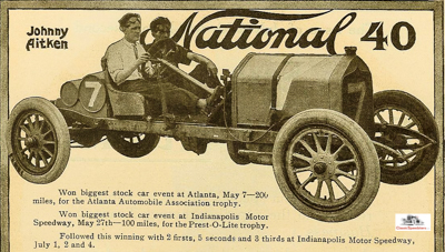
Excerpt from 1910 National ad.
riding in that speedster at the fair with Johnny!
Adventure
Most street speedsters emulated their track cousins in appearance only; they usually did not have the wherewithal to hold up in serious competition. But they sure looked good and often presented enough panache to land a date for a ride in the country, a picnic and… whatever…
1919 PACO Racing body for Ford Model T
Advertisements using speedsters sometimes presented a landscape just begging for someone to barrel through it and get from here to there at a healthy clip. Spin some tires, kick up some dust. Fried chicken and sunset on a blanket.
How about some adventure? Now, that sold!
1917 Stutz Bearcat ad
Images courtesy of the the AACA Library as well as HCFI.org. Some images are also from the editor’s private collection.


